Sawday’s is a certified B Corporation connecting travelers with independent accommodations in the UK and Europe. Their mission is to make travel better for the environment and the communities it impacts—values I share as someone passionate about slow travel and sustainability.
After completing training in digital accessibility in 2024, while using their website, I noticed opportunities to improve its accessibility. I decided to review the design and suggest ways to make it work better for all visitors.
Expert review
Below is a screenshot of Sawday’s product listings page.
A quick audit revealed two common accessibility issues: low contrast text and small type.
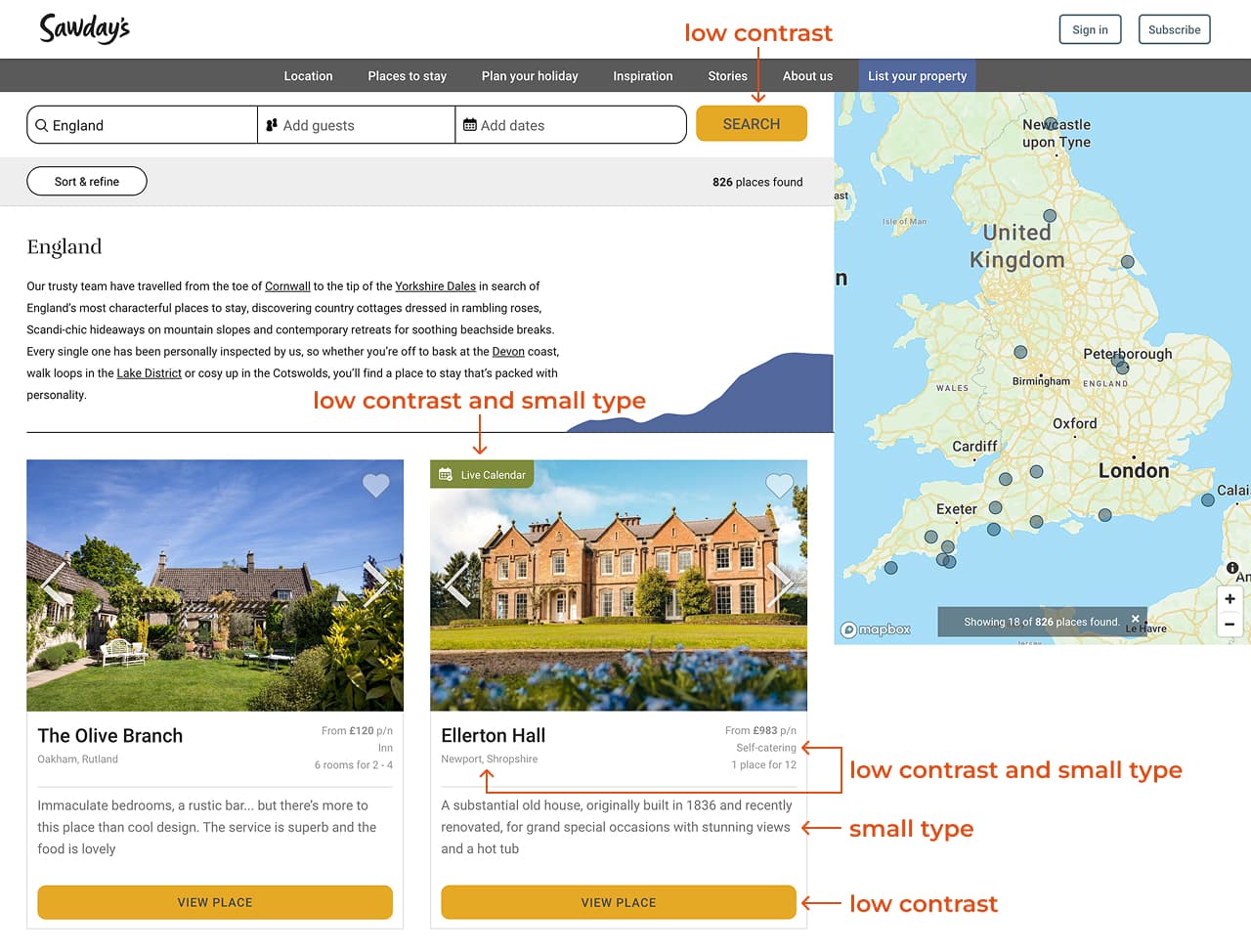
According to the 2025 WebAIM Million report—an accessibility analysis of the top 1,000,000 home pages—low contrast text was the most common issue, appearing on 79.1% of sites.
Visitors, including those with visual impairments, need to be able to clearly perceive content on the page. To improve accessibility for all visitors, use high contrast text and type that’s large enough to read easily.
Several tools can help evaluate contrast and color use. For this audit, I used WAVE and the WebAIM Contrast Checker (see screenshots below).
Web Content Accessibility Guidelines (WCAG) 2 requires a minimum contrast ratio of 4.5:1 between text and background colors (3:1 for large text).


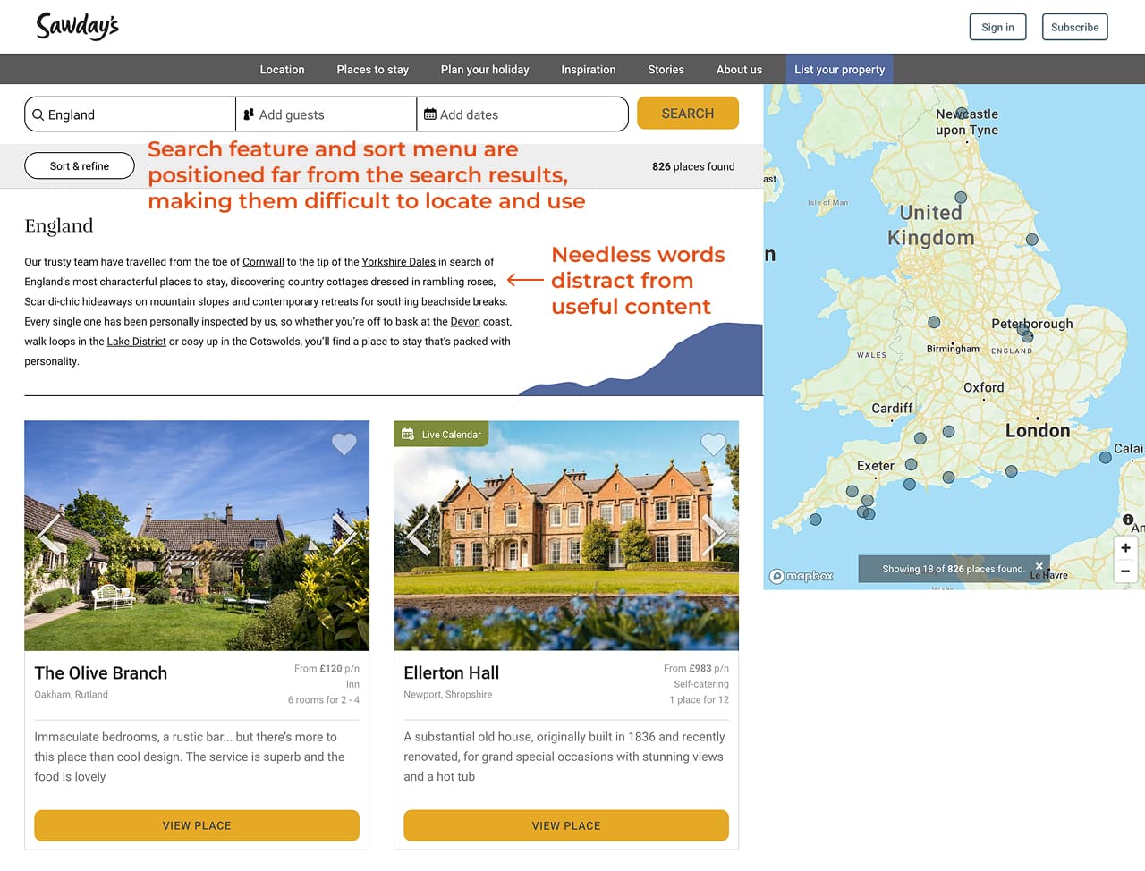
The screenshot below shows another example from the Sawday’s website with low contrast text and small type.

The section also lacks a heading. Headings help all visitors scan the page and understand what each section is about. They’re essential for screen reader users, who rely on headings to navigate page content.
Fixing these common issues alone would greatly improve accessibility for Sawday’s visitors.
In addition to accessibility barriers, I identified usability issues that impact the overall user experience (see screenshot below):
- The search feature and sort menu are positioned far from the search results, making them difficult to locate and use.
- The extra words below the page title add noise and distract from the useful content below.
In Don’t Make Me Think, usability specialist Steve Krug recommends getting rid of words that no one will read in order to:
- Reduce the noise level of the web page.
- Make useful content more prominent.
- Make the page shorter, allowing visitors to see more content at a glance without scrolling.
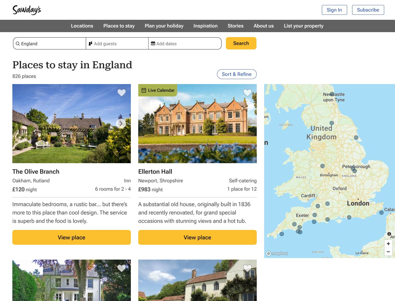
Suggestions for improvement
Below are my suggested revisions to resolve these issues:
- Increased the contrast between the text and background colors and made the type large enough to read easily.
- Added a section heading, “Subscribe to our newsletter,” to explain what this section is about and help visitors scan the page for information.
- Positioned the search feature and sort menu closer to the search results and removed unnecessary words.

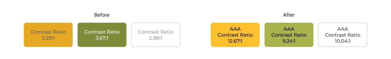
Below are the revised colors with sufficient contrast.
Book a free consultation
Let’s talk about your needs and how I can help. Contact me to book a free 15-minute consultation.
