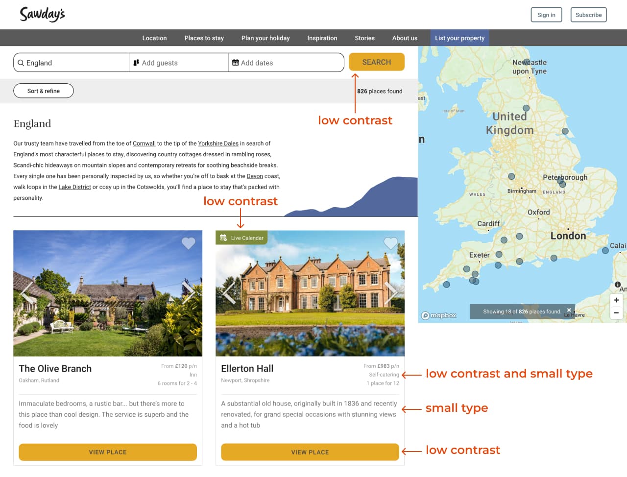
Two of the most common website accessibility issues are low-contrast text and small type. Consider these best practices to improve the usability and accessibility of your website for all visitors:
- Keep the contrast between text and background colors high.
- Make the type large enough for all visitors to read easily.
Let’s look at an example from a travel website, along with my suggestions for improvement.
Expert review
Sawday’s is a B Corp connecting travelers with independent accommodations in the UK and Europe.
A quick website audit revealed low contrast between some of the text and background colors, as well as small type.

Below is another example with small and low-contrast text and a missing heading.

Approach and activities
- I conducted basic accessibility checks using tools such as WAVE and WebAim’s Color Contrast Checker.
- I also created wireframes and visual designs in Figma, and improved some of the content through UX writing.
I used WAVE to evaluate the accessibility of the webpage.

I also used WebAIM’s contrast checker to check colors against the Web Content Accessibility Guidelines (WCAG).

Suggestions for improvement
Below are the revised colors with sufficient contrast.

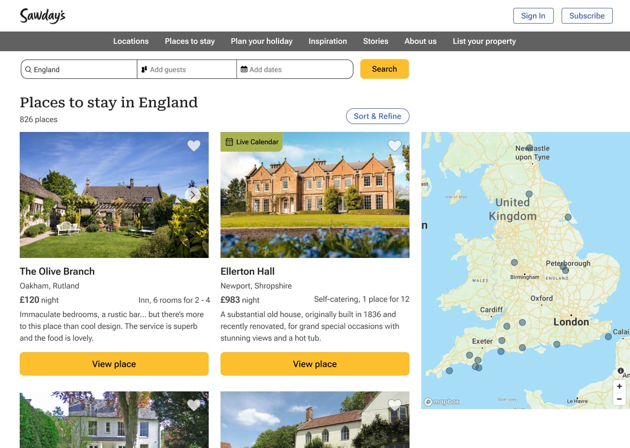
Below are my suggested revisions. I increased the color contrast and text size and made several other usability improvements.

I added a heading and revised the text.

Solution and impact
- Improved color contrast and legible font size for all users, including users with low vision.
- Improved usability of the checkout process.
Book a consultation
Let’s talk about your needs and how I can help. Contact me to book a free 30-minute consultation.