Recently, I used Getty Museums’ mobile site to reserve tickets and noticed opportunities for improvement. I decided to review the design and suggest ways to improve it.
Expert review
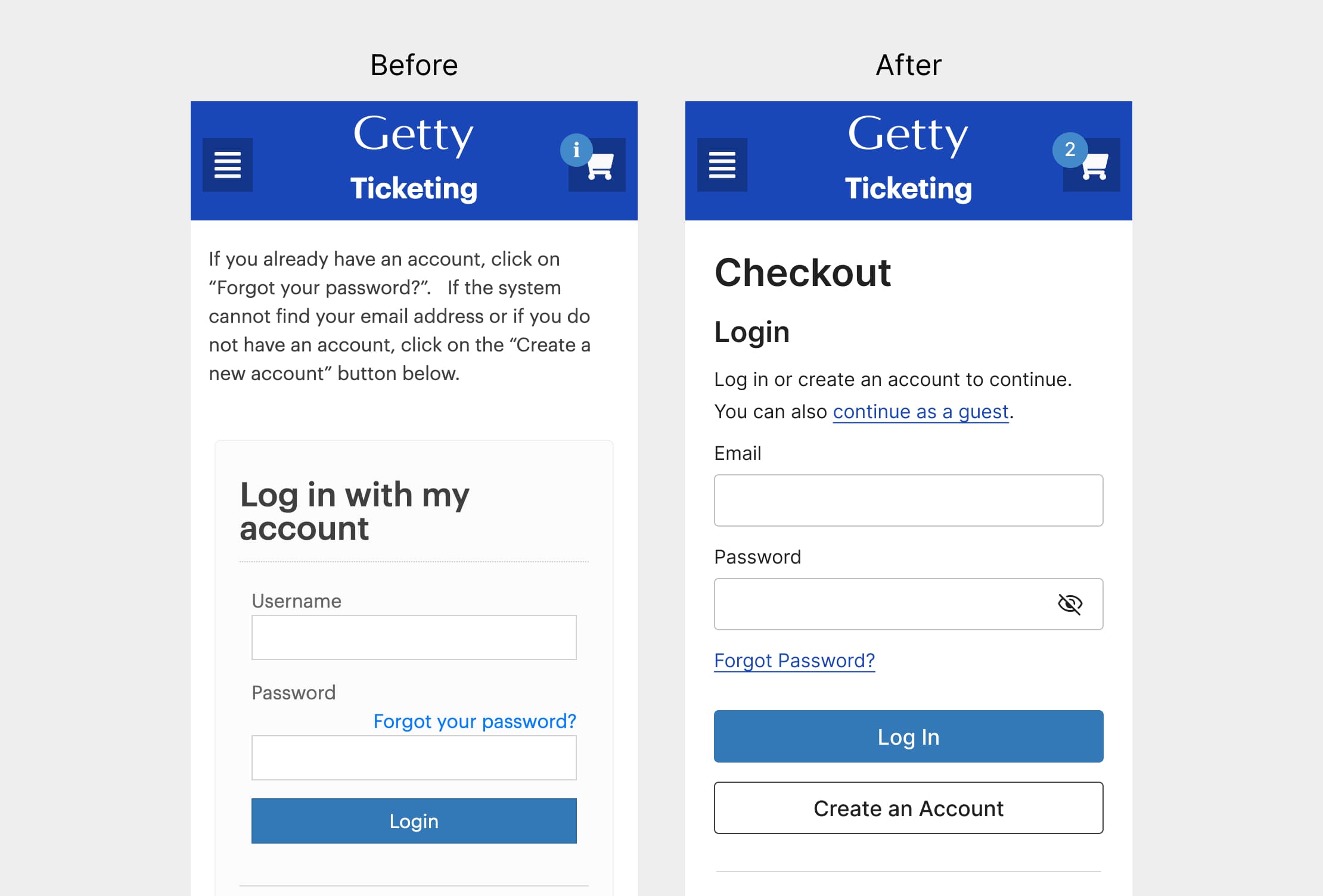
I’ve limited the scope of this exercise to the checkout page. Below is a screenshot of the existing content and the issues I identified.

Annotations:
- The shopping cart icon displays an exclamation mark instead of the number of tickets. This is not the design pattern people expect.
- During checkout, the design prompts users to log in or create an account. There’s no option to check out as a guest for users who might not need an account.
- The site refers to the user as “you” in one place and “I” in another: “Log in with my account. You will need to create an account to order tickets if you do not already have one.” It’s good practice to use “I,” “you,” and “we” consistently.
- For usability and accessibility, it’s best practice to distinguish links from body text using more than just color (e.g., underline).
- For actions, it’s good practice to start with a verb. “Log in” is the correct form when used as a verb.
Competitive review
Other museums make it easy for users to book tickets by providing an option to check out as a guest.

Suggestions for improvement
Below are my suggestions for improvement.

Annotations:
- Updated the shopping cart icon to display the number of tickets.
- Revised the text to read: “Log in or create an account. You can also continue as a guest.”
- Added an underline to the “Forgot Password?” text link.
- For actions, it’s good practice to start with a verb. “Log in” is the correct form when used as a verb.
- Included an option to check out as a guest.
Book a consultation
Let’s talk about your needs and how I can help. Contact me to book a free 30-minute consultation.
