I’ve been buying used books from Better World Books for a while. This time, I wanted to buy a gift certificate and have it sent directly to the recipient. However, I found the experience confusing. I decided to review the design and suggest ways to improve it.
Expert review
Below is a screenshot of the Gift Certificates page and the issues I identified.
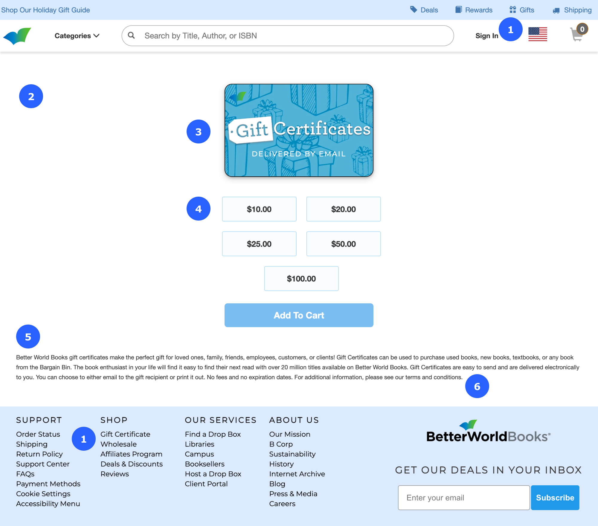
Annotations:
- The links labeled “Gifts” in the navigation bar and “Gift Certificate” in the footer take you to the same page, but they use different words. It’s good practice to use consistent wording for links that lead to the same page.
- The page lacks a headline or first-level heading (<H1>).
- The Web Content Accessibility Guidelines (WCAG) advise against using text in images, except for logos. If you do use text in an image, the alternative text should match the words in the image. In this case, the image does not have alternative text.
- It isn’t necessary to include the decimal and two zeros for whole dollar amounts.
- Small text and long lines are difficult to read. Make the type large enough for all visitors to read easily and keep lines medium length (about 50 to 70 characters or 8 to 10 words).
- It’s not obvious that “terms and conditions” is a text link. It’s good practice to underline text links to make them easy to spot.
Below is the Checkout page where I got confused. When I started my task, I assumed (from similar experiences with other online stores) that the bookstore would send the gift certificate directly to the recipient. I couldn’t find a place to enter the recipient’s email or add a message. I left the website and didn’t complete my task.
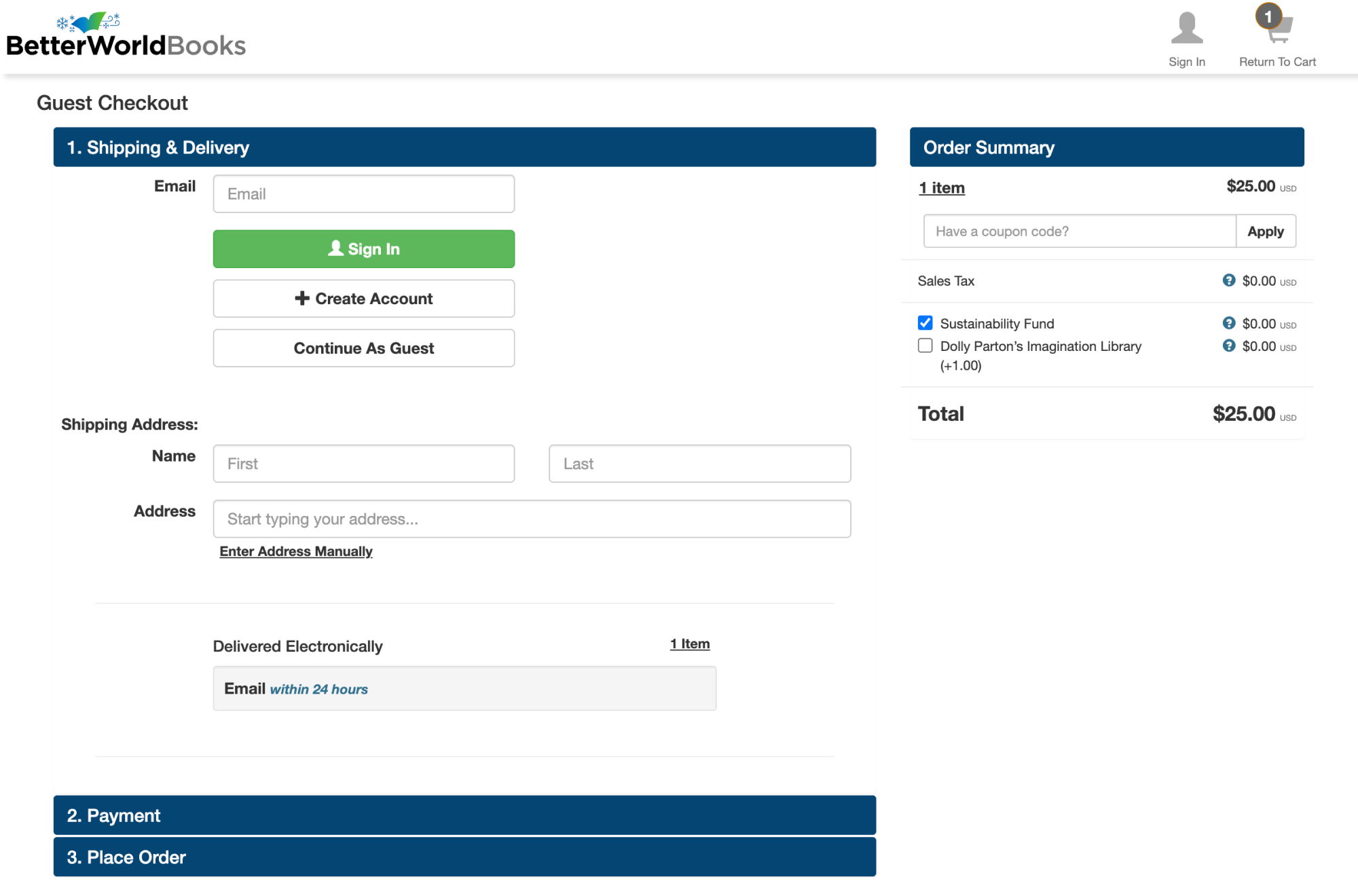
If I had read the text at the bottom of the previous page that says, “Gift Certificates are easy to send and are delivered electronically to you. You can choose to either email to the gift recipient or print it out,” I would have known what to expect next.
Competitive review
I was curious about the user experience of other bookstores. Below is a screenshot of the Bookshop.org Gift Cards page. The content on Bookshop.org is clear and easy to scan and understand.

Annotations:
- The link labeled “Gift Cards” in the navigation bar matches the page headline, “Bookshop.org Gift Cards.”
- Information about the gift cards (answers to users’ questions) is at the top of the page.
- Field labels, such as “To” and “From”, and the option to add a message, make it clear that the gift card will be sent to the recipient.
- The gift amounts do not include the decimal and two zeros.
Suggestions for improvement
Below is a wireframe I designed in Figma with my suggestions for improvement.
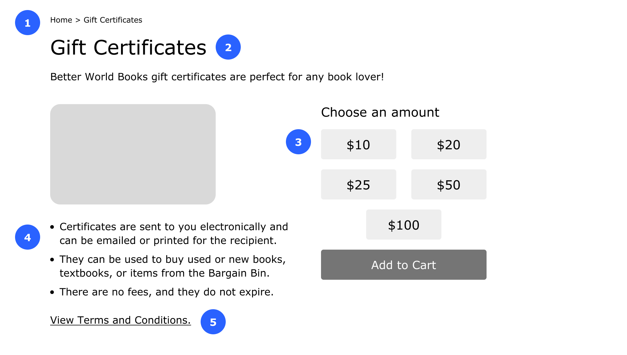
Annotations:
- Added a breadcrumb trail (Home > Gift Certificates) to guide visitors around the site, and made its wording consistent with the page title and headline.
- Added a headline to make it clear where people are on the site. A headline (coded with the <H1> tag) with keywords that match what site visitors search for can help with search engine optimization (SEO).
- Added a heading and removed the decimal and two zeros from the whole dollar amounts.
- Made the information about the gift certificates easy to scan with a list. I also made the text larger and the lines medium in length.
- Underlined the “terms and conditions” text link to make it easy to spot.
Book a consultation
Let’s talk about your needs and how I can help. Contact me to book a free 30-minute consultation.
