I’ve been buying used books from Better World Books for a few years. I love that every purchase makes a difference through donations and environmental programs.
Recently, I wanted to buy a gift certificate and send it directly to the recipient. Some steps in the process weren’t immediately clear to me, and I didn’t move forward with the purchase.
This UX review looks at the gift certificate purchase experience, focusing on usability and accessibility, and highlights opportunities to make it clearer and easier for customers.
Opportunities for improvement
Below is a screenshot of the Gift Certificates page, along with a few observations, the impact on users, and opportunities for improvement.
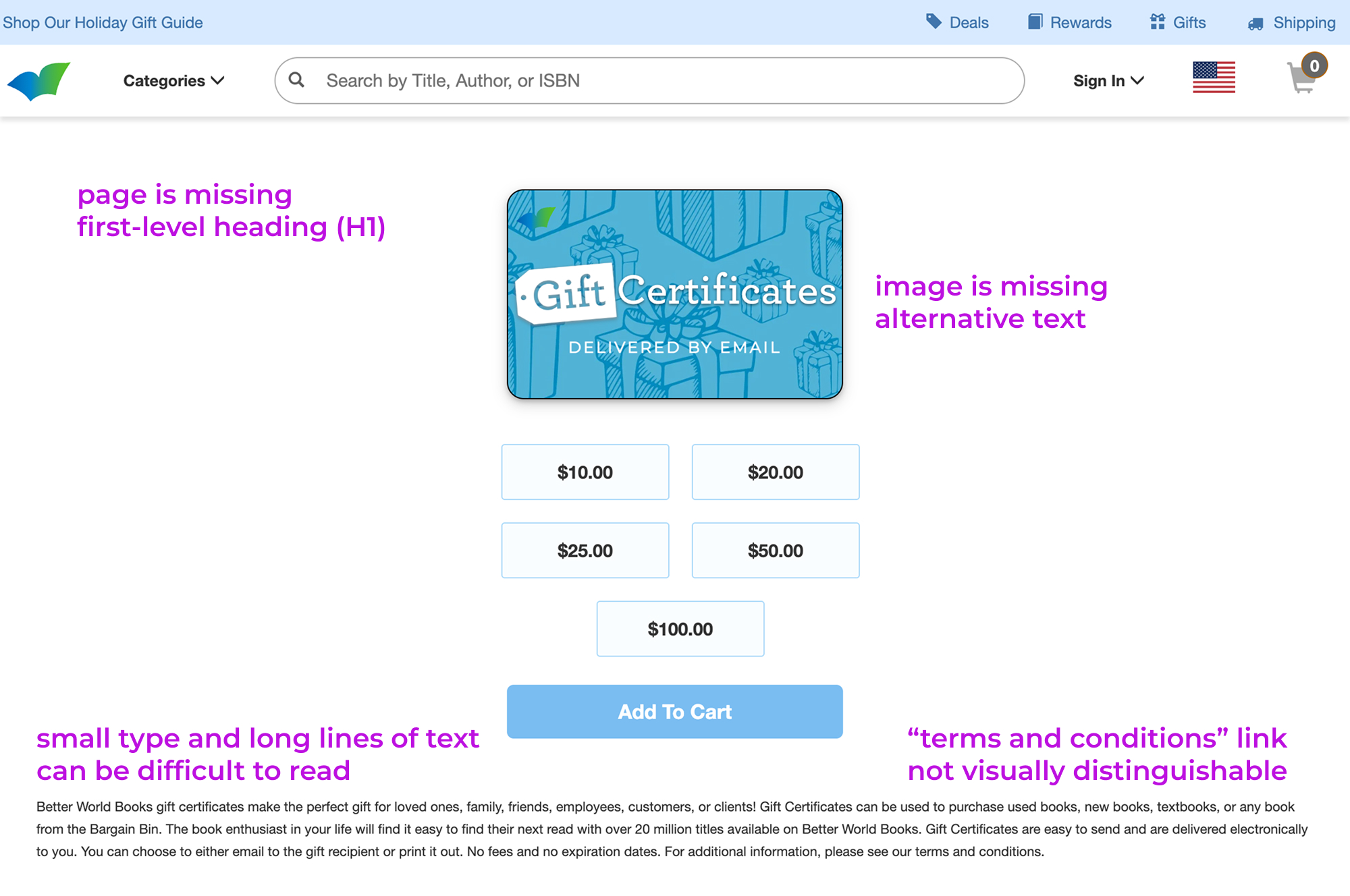
Gift Certificates page
- The page does not include a headline or first-level heading (H1). Headings help visitors quickly understand where they are, make content accessible for people navigating the page with screen readers, and also support Search Engine Optimization (SEO).
- The Web Content Accessibility Guidelines (WCAG) recommend avoiding text in images (such as “gift certificates delivered by email”). If you do use text in an image, the alternative text should match the words in the image. In this case, the image is missing alternative text, which may prevent users of assistive technology from accessing important content.
- Small type and long lines of text can be difficult to read, especially on mobile devices or for users with visual impairments. Increasing text size and keeping lines to a medium length improves usability and accessibility.
- The “terms and conditions” link is styled similarly to the surrounding text. Users may overlook important supporting information if links are not visually distinguishable.
Checkout page
When I got to the Checkout page (see below), I expected, from similar experiences with other online bookstores, that Better World Books would deliver the digital gift certificate directly to the recipient.
I couldn’t find a place to enter the recipient’s email address or add a message. I exited the purchase flow before completing the task.
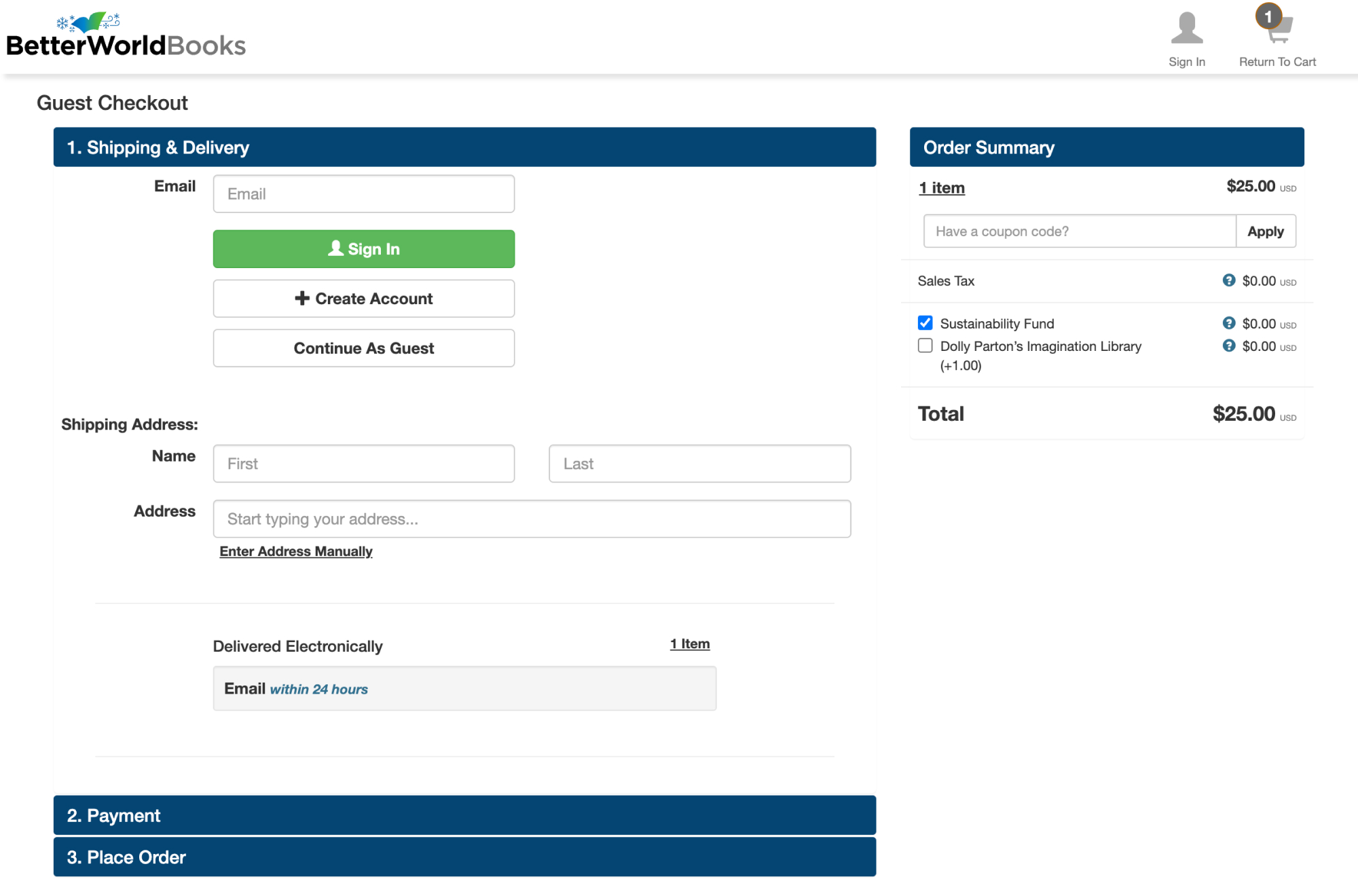
Information explaining gift certificate delivery appears lower on the previous page, but it may be missed during scanning. Clarifying delivery expectations earlier in the flow could better align with user mental models and reduce abandonment.
Comparative example
I was curious to see how other bookstores approach the gift certificate experience.
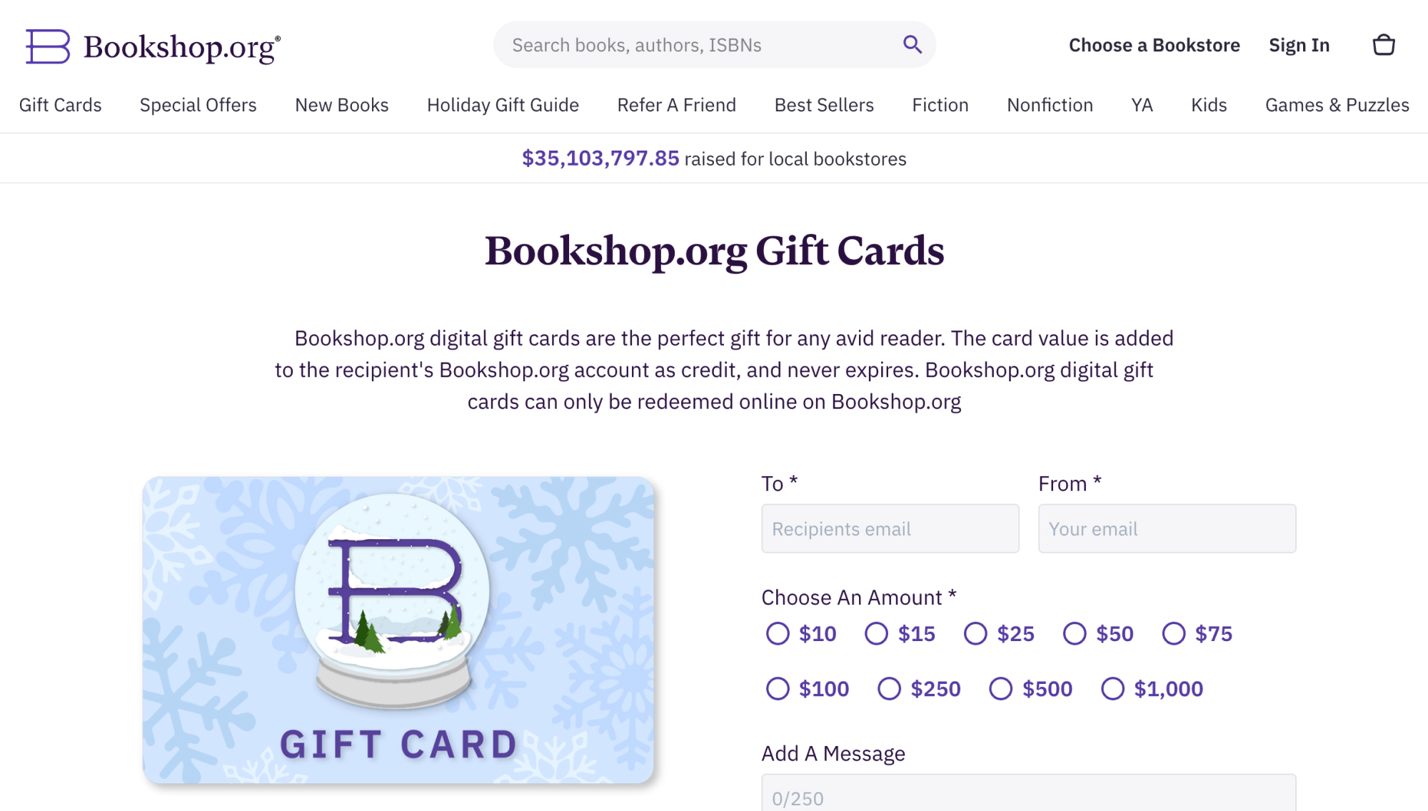
Bookshop.org’s Gift Cards page clearly communicates how the gift card will be delivered, who receives it, and where personalization occurs.
Clear field labels (“To,” “From”), along with scannable information, help users quickly understand how to complete the purchase.
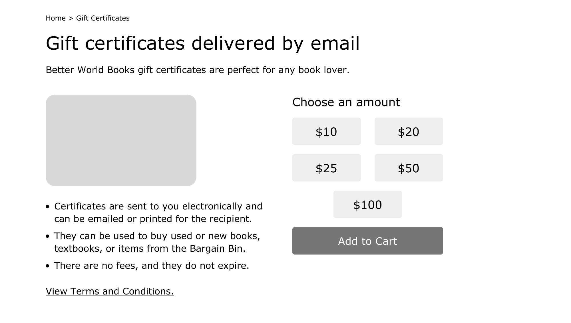
Design exploration
To explore potential improvements, I created a conceptual wireframe that illustrates how small adjustments could enhance usability and accessibility.
Ideas explored include clearer page hierarchy, improved content scanning, enhanced link visibility, and simplified pricing presentation.
This wireframe represents one possible direction rather than a finalized redesign.
Gift purchases often involve higher uncertainty because users are completing tasks on behalf of someone else. Clear expectations around delivery and personalization can significantly reduce hesitation and support task completion.
Interested in an expert review?
I provide website audits for sustainable e-commerce brands looking to create more accessible, usable, and inclusive digital experiences.
Book a free 15-minute consultation to discuss your website.
This review is created for educational purposes, based solely on publicly available pages. I’m not affiliated with or commissioned by Better World Books, and no internal data was accessed.
